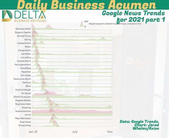
Thanks to Axios for putting this together, they have been doing it since 2017 and is a fun view to look at that is dominating peoples news interests. As outlined by Axios:
This graphic is an annual Axios tradition that began back in 2017, when we were a tiny company in shared office space.
Back then, Stef Kight — who was one of Axios’ first employees, and now covers politics, immigration and demographics — and our former colleague Lazaro Gamio came up with this graphic as a way to visualize “The insane news cycle of Trump’s presidency in 1 chart.”
Axios AM By Mike Allen ·Dec 30, 2021
This has been broken into two part covering the first part of the year with the second part following tomorrow.
